Viewing a report
KPI cards, type-specific tables, date range picker, and the report switcher.
Click a report row, or use the Report switcher at the top of the app, and the report opens at the report's page.
Header
At the top of the page:
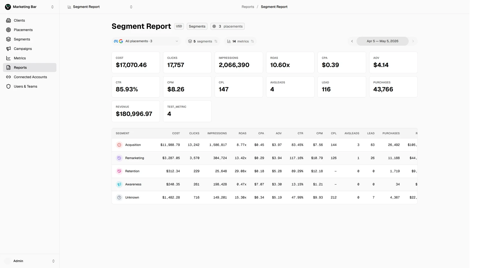
- The report name.
- A currency badge — the reporting currency.
- A type badge — Segments / Campaigns / Months / Placements.
- A placements count badge.
- A groups count badge (Placements reports only).
- An Edit button (only if you have permission on this report).
Below the header is the filters panel, then the KPI cards, then the main table.
Filters panel
Three controls (visibility depends on report type):
- Placements multi-select — narrow the report to a subset of its configured placements without editing the report. Hidden for Placements-type reports.
- Customize Segments — opens the customize modal for segments. Visible for Segments-type only.
- Customize Metrics — opens the customize modal for metrics. Always visible.
- Date range picker — covered below. Visible for all types except Months (where the rows are months by definition).
Filter changes are per user, per report — saved in your browser. They don't affect what other people see.
KPI cards
A grid of cards at the top of the report, one per visible metric. The layout adjusts to your screen — 2 columns on phones, more as the screen gets wider.
Each card shows the metric label and its total. Currency / percent / ratio formatting is applied automatically based on the metric's name. Empty cells render as — so you can tell missing data from zero.
The KPI numbers are the totals across whatever rows the table shows — they update when you change the date range or placement filter.
The table
Different table per report type:
Segments
Rows = segments selected in the report. Each row shows the segment's icon and color dot, the segment name, then one column per metric. Desktop has a sticky left column so segments stay visible as you scroll horizontally; mobile renders cards instead.
Campaigns
Rows = individual campaigns across the chosen placements.
- Sortable — click any metric header to sort ascending; click again for descending.
- Filterable — a search box at the top of the table filters by campaign name.
Sort state is preserved while you're viewing the report. It's not saved across sessions.
Months
Rows = calendar months in chronological order. Each row is one month; columns are metrics. The date range picker is hidden — Months reports show every month with data for the selected placements.
Placements
Rows = the placement groups you defined when you built the report. Group order is what you set in the report drawer (drag-to-reorder).
Date range picker
A calendar with two ways to pick:
- Free-form range — click a start date, then an end date.
- Presets — Today, This week, MTD, Last 30 days, MoM, QoQ, YoY.
Future dates are blocked (the calendar greys them out). Whatever you pick is remembered next time you open this report. See Date ranges for the deep dive.
Report switcher
Top of the app, next to the client switcher, the Report switcher lets you jump between reports of the active client without going back to the list. It shows every report you have access to with name, type badge, and last updated date. Click one and you're there.
Live data
Reports refresh when you load them. Numbers reflect whatever data Level has at that moment — fresh sync data lands continuously throughout the day, so reloading the page is enough to see the latest.
Permissions
- Open / view: anyone with read access to this report.
- Edit: only members with edit-level access on this specific report (set under Users & Teams).
- Customize for yourself: anyone who can view (customizations are per user, not on the report definition).