Months report
Rows = calendar months in chronological order. Best for trend lines — is the metric climbing or sliding?
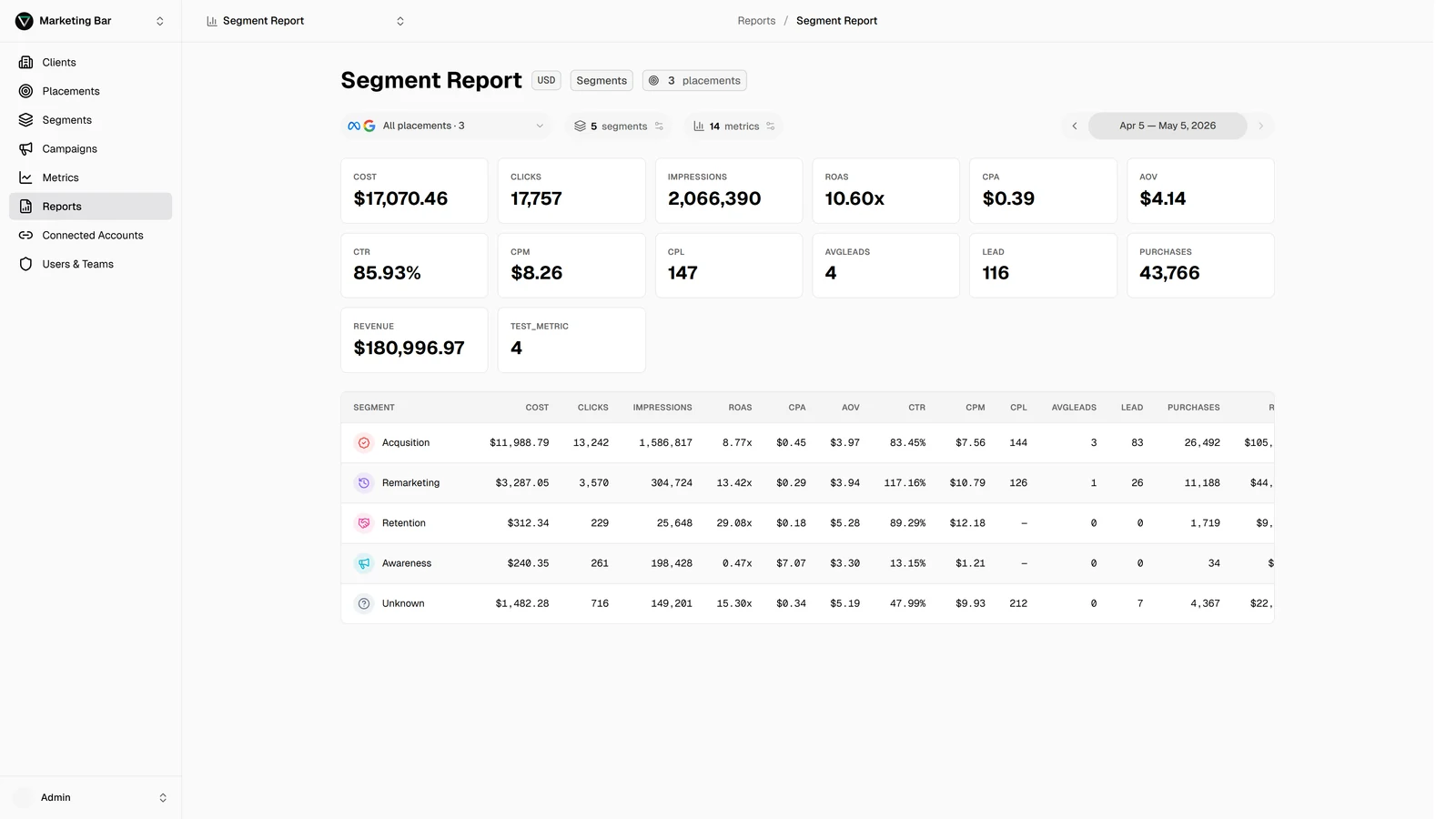
A Months report turns the same numbers a Campaigns or Segments report shows into a vertical time series. Each row is a calendar month; columns are your metrics. It's the right view when the question is "is this getting better or worse?"
Building one
- Type → Months.
- Placements → multi-select. Each row sums across all of them.
- Metrics → multi-select.
What the table shows
One row per calendar month that has data for the chosen placements. Rows are sorted chronologically — oldest at the top, newest at the bottom (or reversed depending on the report's preference; default is chronological).
Each row's metric values are the totals for that month across every placement included in the report.
Date range is implicit, not optional
The date-range picker is hidden for Months-type reports — there's no "narrow to a date window" filter. The report shows every month with data automatically. To look at a subset:
- Edit the report to narrow the placements (months without data on the remaining placements drop out).
- Mentally — scroll to the relevant rows.
This is by design: a Months report is meant to show the full timeline. If you want a six-month window, a Segments / Campaigns / Placements report with a date range filter does that.
Spotting trends
Common reading patterns:
- Cost climbing month-over-month, conversions flat → likely auction inflation; CPA is rising.
- ROAS dropping over six months → re-examine creative refreshes and audience saturation.
- Sudden jump in one month → check what changed (new placement added, big launch, conversion mapping changed?).
For period-over-period comparisons (MoM %, YoY %) you'd typically derive a custom metric or do the comparison in a spreadsheet — Level shows the absolute values, not the deltas.
Aggregation for multiple placements
Different placements can be in different currencies. The Months report:
- Computes each placement's monthly total in the placement's native currency.
- Converts to the report's reporting currency at the daily exchange rate (so a single month's cost may include data converted at slightly different rates if exchange rates moved).
- Sums across placements for the row total.
For most reporting use cases the daily-rate-vs-monthly-rate distinction doesn't matter — but it's why Level's monthly numbers may not exactly match what a single platform reports if you're comparing currencies.
Best for
- Trend lines for board / stakeholder reviews.
- Spotting seasonality — we always dip in August, ship a campaign in early September.
- Sanity-checking that data is flowing — long sequences of zero rows mean a placement isn't syncing.
Not ideal for
- Drilling into specific campaigns → Campaigns report.
- Funnel rollups by intent → Segments report.
- Channel breakdowns → Placements report.